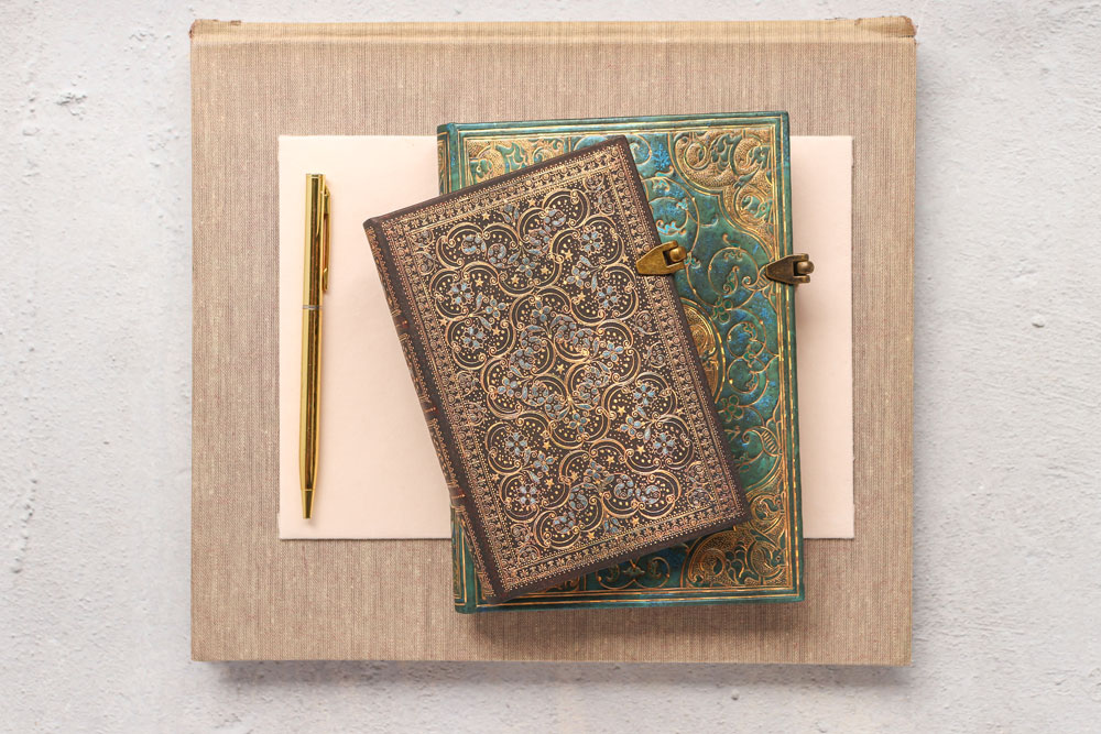
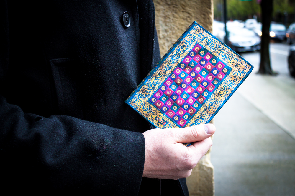
What makes a Paperblanks design unique? Is it our cover textures, foiling and debossing? Is it our unique closures, iconic red ribbon or book edge printing?
Well yes, all of the above, but mostly what makes a Paperblanks journal so special is the true story behind the cover art. We scour markets, museums, libraries and personal collections all around the world to bring back the most exciting and diverse art we can find. From contemporary digital art to handwritten manuscripts, each Paperblanks design tells an inspiring story of soulful creation.
But, by far, our best known and most beloved designs come from the world of antique bookbinding. Our talented Graphics team spends hours lovingly restoring each binding to its original glory, adding our unique textures, shimmering details and vibrant colour choices. So it’s no surprise that five of our current bestselling designs reproduce antique book bindings.
Discover some fun facts behind these classic design stories below!
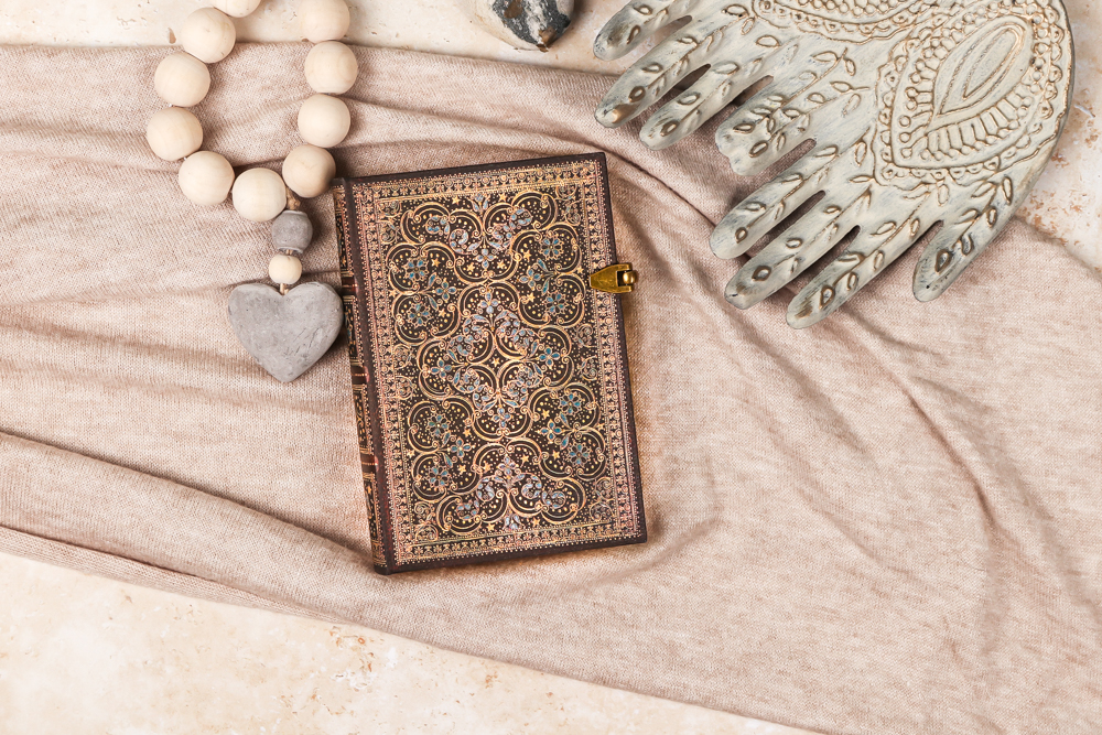
Restoration (The Queen’s Binding)
Original Artwork: Binding for Richard Allestree’s The Government of the Tongue
Era: 1675
Region: England
Originally crafted in 1675 by the Queens’ Binder “A,” the balance of open space and intricate elements make it a shining jewel of the period. The binding was created to hold The Government of the Tongue by Richard Allestree, provost of Eton College.
- We also produced this design with a brighter green background and as a softcover Flexi notebook under the name Pinnacle
- Our Graphics team was drawn to work with this binding because it has a perfect balance of space and busy elements, gorgeous frame all around it and little stars spread harmoniously all over
- The Queens’ Binder is a name given to a small group of English bookbinders active during the Restoration Period (1660–1700), which was known as the “Golden Age of English Bookbinding”
- Richard Allestree wrote The Government of the Tongue to serve as a partner to his treatise on biblical interpretation, The Lively Oracles Given to Us – interestingly, the beloved Irish poet Seamus Heaney published a volume of critical essays examining the poetry of other masterful poets also called The Government of the Tongue in 1988
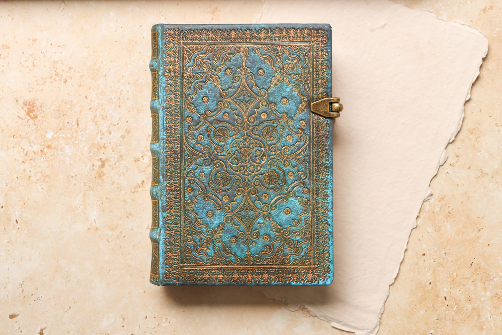
Azure (Equinoxe)
Original Artwork: L’office de la Semaine Sainte book binding
Era: 1688
Region: Paris, France
The 1688 edition of L’office de la Semaine Sainte, a Latin liturgical book, was protected by a gold-plated leather binding. Reproduced on our Azure journal with a vibrant blue background, the antique design features an elaborate gilt-edged tendril motif.
- This edition contained a translation by Michel de Marolles, a French clergyman, translator and French historian best known for his collection of prints and manuscripts
- This volume contained the daily hours of Roman Catholic prayer, which was was published as the Breviarium Romanum (Roman Breviary) until the reforms of Paul VI, when it became known as the Liturgy of the Hours
- In cultures around the world, the first full moon after the vernal equinox is considered to be a sacred time, and the original text housed inside this cover outlined many rites and rituals to be observed during this period, which is how we came to name this series Equinoxe
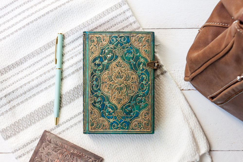
Turquoise Chronicles
Original Artwork: Chroniques, crafted by Salel Binder
Era: 16th century
Region: Paris, France
This cover is based on the binding for a book titled Chroniques, published by Salel Binder in Paris in 1514. The exuberance of the design reflects the splendour of the Renaissance approach to decoration.
- The original has exquisite golden filigree detailing but has a simple brown background – we brought out the details of the design with the jewel-toned version
- The 16th century saw the Renaissance arrive in Paris and the Kings of France returned to the city from the Loire Valley, making Paris the centre of France’s art and cultural life
- This binding also comes from a unique point in bookbinding history, when wood was replaced with paper pasteboards as the preferred cover material and gool tooling, like we can see here, became more prominent
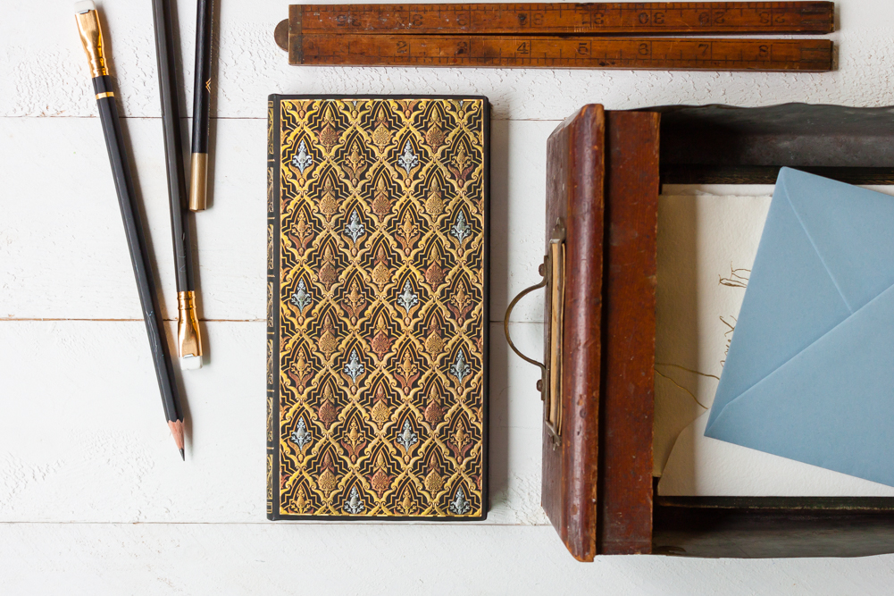
Destiny (Voltaire’s Book of Fate)
Original Artwork: Chamerot et Renouard’s binding for Voltaire’s Book of Fate
Era: Bound in 1893, first published in 1747
Region: France
This design comes from an 1893 binding housing Voltaire’s Zadig, or The Book of Fate. First published in 1747, it tells the story of Zadig, an ancient Babylonian philosopher.
- Zadig is a philosophical treatise that provides thematic inspiration for the modern detective story, including for Edgar Allan Poe’s C. Auguste Dupin, and Voltaire himself was inspired by the Persian tale The Three Princes of Serendip
- The specific edition we have reproduced was first owned by Henri Beraldi and is representative of the postwar generation of French bibliophiles – after an 1879 defeat by Prussia, the French turned to tangible objects of physical beauty, like books, to showcase their creative ideals and a sense of authenticity
- Voltaire, though still a man of his era, is remembered today as a courageous fighter for civil rights
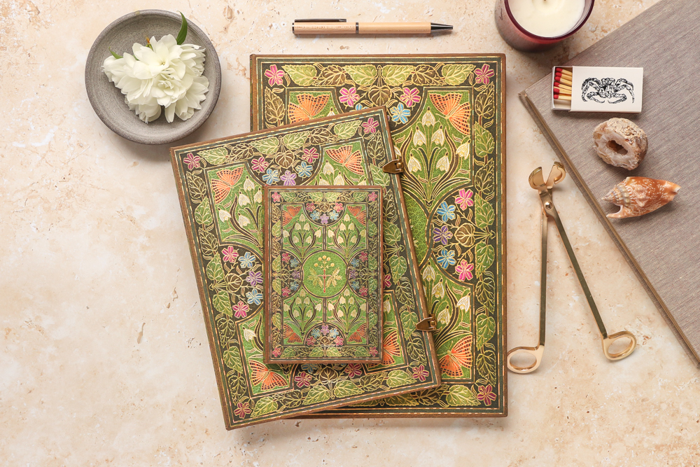
Poetry in Bloom
Original Artwork: Binding by Riviere and Son for Shelley’s The Sensitive Plant and Early Poems
Era: 1910
Region: London, England
The design reproduced on this cover centres around a sensitive plant surrounded by other richly hued flowers, foliage and butterflies. The binding was used for The Sensitive Plant and Early Poems by Percy Bysshe Shelley.
- The white flowers in the cover design echo the original contents (the “sensitive plant,” or mimosa pudica), as the poem anthropomorphizes flowers and plants as the main characters, with their own desires and needs
- Percy Bysshe Shelley was a major figure in Romantic era writing, and was the husband of Mary Shelley (Frankenstein)
- Though Poetry in Bloom does reproduce an antique book binding, it is much more contemporary than many others we have worked with, and we love its Art Nouveau look
What is your favourite style of cover art? Are there any Paperblanks design stories you’d like to learn more about?
Let us know in the comments!

